Helvetica is a font loved by designers worldwide for its clean lines and timeless elegance. This iconic typeface is known for its clarity and simplicity, making it a go-to choice for everything from corporate branding to subway signage. If you’re looking for similar options that maintain that neat and professional look, you’re in the right place. In this article, we’ve compiled a list of 20 fonts that share Helvetica’s commitment to clean and clear typography. Let’s explore these alternatives to find the perfect font for your next design endeavor!
What we cover
1. Akzidenz Grotesk

Why Similar: Often cited as the precursor to Helvetica, Akzidenz Grotesk features a more irregular character shape and slightly condensed letters, giving it a straightforward yet approachable appearance.
2. Arial

Why Similar: Developed as a more accessible alternative to Helvetica, Arial has a nearly identical character set and layout but with slight variations in letter shapes and widths. It’s ubiquitous in digital and print media, offering excellent readability and a modern look.
3. Arimo

Why Similar: Arimo is designed as a metric-compatible alternative to Arial and therefore closely resembles Helvetica in both form and function. It is optimized for screen use, making it a great choice for digital design that requires clarity and simplicity.
4. Avenir

Why Similar: Although more geometric, Avenir maintains a clean and professional look similar to Helvetica, with well-balanced proportions and a harmonious appearance. Its open forms and distinct styling make it versatile for various text-heavy applications.
5. Be Vietnam

Why Similar: It balances humanist and geometric styles, producing a friendly yet clear appearance that echoes Helvetica’s neutrality. The font is designed for both display and body text, offering extensive language support and stylistic variants.
6. Cloud

Why Similar: With a modern sans-serif design, Cloud offers a clean and clear typeface that emulates Helvetica’s legibility and simplicity. Ideal for digital platforms, it provides a light and airy feel without sacrificing readability.
7. DIN Next

Why Similar: Originally designed for legibility in technical and traffic signage, DIN Next is straightforward and functional, akin to Helvetica. It has a range of weights and styles, enhancing its versatility in various design contexts.
8. Futura

Why Similar: Futura is a geometric sans-serif that prioritizes simplicity and functionality, two hallmarks of Helvetica. Its distinctive geometric shapes and even weight distribution lend a modernist touch to any text.
9. Gotham

Why Similar: Like Helvetica, Gotham is celebrated for its wide range of applications, thanks to its honest tone and clear, open forms. It was inspired by architectural signage and offers a friendly yet authoritative voice.
10. IBM Plex Sans
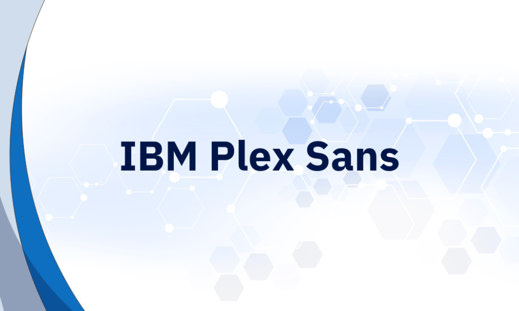
Why Similar: This font combines geometric forms with fine details to ensure legibility at both large and small sizes, much like Helvetica. It’s designed to perform well in user interfaces, making it ideal for digital contexts.
11. Inter

Why Similar: Specifically created for digital screens, Inter features a tall x-height like Helvetica, enhancing its readability at small sizes. The spacing and kerning are optimized for UI environments.
12. ITC Franklin Gothic LT
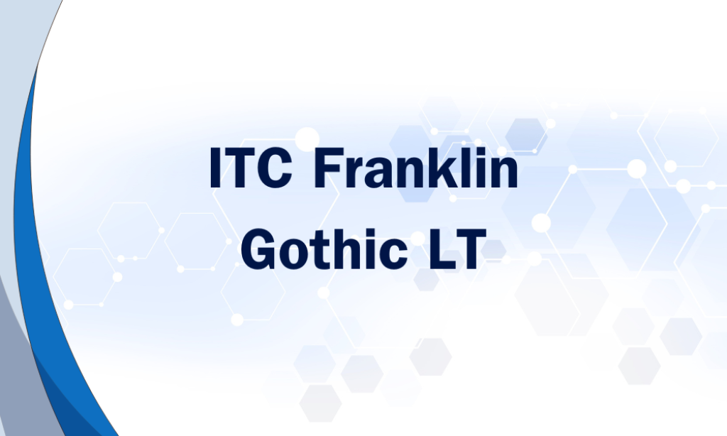
Why Similar: This sturdy, text-friendly font offers simplicity and readability, with a straightforward appearance that aligns with Helvetica’s aesthetics. It’s particularly effective for headlines and text blocks.
13. Lato

Why Similar: Lato was designed to maintain a semi-rounded character in letters, which adds a level of warmth to the clean design, reminiscent of Helvetica. The balance between classic structure and friendly features makes it versatile.
14. Montserrat

Why Similar: Inspired by urban typography from the early 20th century, Montserrat channels the clarity and neutrality of Helvetica. It is well-suited for both text and display use, offering a versatile design palette.
15. Nunito

Why Similar: A well-balanced sans serif with rounded terminals that provides excellent readability and a friendly appearance. Its clean and clear lines make it effective for both digital and print media.
16. Open Sans

Why Similar: Designed with upright stress and open forms, Open Sans shares Helvetica’s clarity and simplicity, making it highly legible. It’s extremely versatile and has been widely adopted for web and print use.
17. Proxima Nova
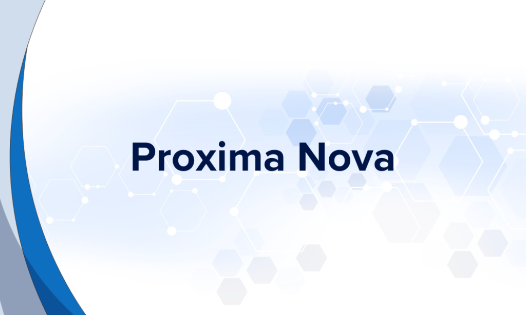
Why Similar: It bridges the gap between typefaces like Helvetica and classic sans fonts with its modern proportions and approachable feel. Known for its wide range of weights and styles, it’s highly adaptable to different design needs.
18. Roboto

Why Similar: Roboto offers a mechanical skeleton and largely geometric forms, but with friendly and open curves, making it similar to Helvetica. Optimized for readability on mobile devices, it’s perfect for digital interfaces.
19. TeX Gyre Pagella
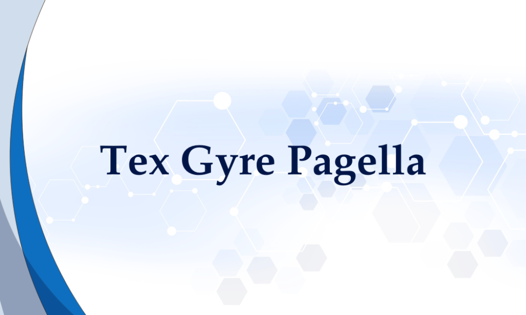
Why Similar: Although primarily a serif font, it offers the same clarity and professionalism as Helvetica in its sans-serif applications. It’s ideal for academic and formal documents where clarity is paramount.
20. Univers

Why Similar: Like Helvetica, Univers is celebrated for its vast family of styles and consistent legibility. It’s known for its precision and clarity, making it suitable for a wide range of typographic needs.