Choosing the right font can make a significant difference in how your document is perceived. Serif fonts are known for their classic and elegant design, making them a popular choice for various types of writing, from formal reports to creative projects. In this article, we’ll explore 15 must-try serif fonts that can instantly elevate the appearance of your Word documents. Each of these serif fonts brings unique characteristics and design elements that can enhance the visual appeal, readability, and professionalism of your Word documents, making them essential choices to elevate your typography game.
What we cover
1. Arapey

Why it is a must-try Serif font: Arapey is a modern serif font with a unique flair, featuring slightly condensed letterforms and a tall x-height. Its elegant and sophisticated design makes it suitable for headings and titles in documents, adding a touch of style and professionalism.
2. Cambria

Why it is a must-try Serif font: Cambria is a versatile serif font known for its readability and clarity, making it an excellent choice for body text in Word documents. Its balanced proportions and sturdy serifs ensure that text remains easy to read even at smaller sizes.
3. Caslon #3

Why it is a must-try Serif font: Caslon #3 is a classic serif font with a timeless appeal. Its well-defined serifs and moderate contrast between thick and thin strokes make it ideal for conveying a sense of tradition and reliability in documents, such as formal reports or business correspondence.
4. Cormorant Garamond

Why it is a must-try Serif font: Cormorant Garamond is a refined and elegant serif font inspired by the classic Garamond typeface. Its graceful curves and balanced proportions make it suitable for various text-heavy applications, providing a harmonious and sophisticated look to your Word documents.
5. Didot LP

Why it is a must-try Serif font: Didot LP is a high-contrast serif font known for its fashion-forward aesthetic and editorial elegance. Its thin, elongated serifs and vertical stress lend a modern and stylish vibe to headings and titles, making it a standout choice for fashion magazines or creative projects.
6. Fry’s Baskerville

Why it is a must-try Serif font: Fry’s Baskerville is a contemporary interpretation of the timeless Baskerville typeface. Its clean lines, subtle contrasts, and sturdy serifs make it a versatile choice for both body text and headings, adding a touch of refinement and professionalism to your Word documents.
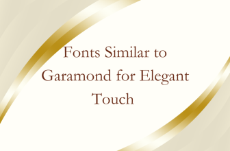
7. Garamond

Why it is a must-try Serif font: Garamond is a classic and widely-used serif font known for its readability and elegance. Its moderate x-height, balanced proportions, and old-style figures make it a suitable choice for various text-heavy documents, maintaining a timeless and sophisticated appearance.
8. Georgia Pro

Why it is a must-try Serif font: Georgia Pro is an updated version of the popular Georgia font, designed for enhanced readability on digital screens. Its sturdy serifs, open counters, and generous spacing make it a reliable choice for body text in Word documents, ensuring optimal legibility across devices.
9. Gilda Display

Why it is a must-try Serif font: Gilda Display is a decorative serif font with a vintage-inspired look. Its ornate details, high contrast, and delicate serifs make it a standout choice for headers, titles, or creative projects where a touch of nostalgia and charm is desired.
10. Goudy

Why it is a must-try Serif font: Goudy is a classic serif font with a timeless and versatile design. Its sturdy serifs, balanced proportions, and graceful curves make it suitable for various text applications, adding a sense of sophistication and readability to your Word documents.
11. Merriweather

Why it is a must-try Serif font: Merriweather is a modern serif font designed for optimal readability on screens. Its generous x-height, open counters, and balanced proportions make it an excellent choice for body text, ensuring clear and legible documents across digital platforms.
12. Noto Serif

Why it is a must-try Serif font: Noto Serif is a versatile and accessible serif font designed to support multiple languages and character sets. Its balanced proportions, sturdy serifs, and wide range of weights make it a practical choice for documents requiring multilingual support, maintaining consistency and readability.
13. Rockwell

Why it is a must-try Serif font: Rockwell is a bold and distinctive slab serif font known for its strong, geometric shapes and modern aesthetic. Its thick strokes, square serifs, and high contrast make it a standout choice for headings and titles, adding impact and visual appeal to your Word documents.
14. Sabon

Why it is a must-try Serif font: Sabon is an elegant and timeless serif font with a harmonious design. Its balanced proportions, moderate contrasts, and subtle serifs make it suitable for various text applications, conveying a sense of classic sophistication and readability in Word documents.
15. Times New Roman

Why it is a must-try Serif font: Times New Roman is a ubiquitous serif font known for its readability and widespread use in print and digital media. Its sturdy serifs, moderate contrasts, and classic design make it a reliable choice for body text in Word documents, ensuring clear and legible content across platforms.