Light fonts, with their clean and uncluttered style, are often a top choice for designers looking to create an approachable and modern look. In this article, we’ve rounded up the 15 best light fonts that are not only stylish but also highly readable. These selections are ideal for a variety of projects, ensuring that your content is both beautiful and easy on the eyes. These fonts have been chosen for their distinct characteristics that contribute to making text accessible and easy to digest, thereby improving the overall reading experience.
What we cover
1. Alegreya Sans
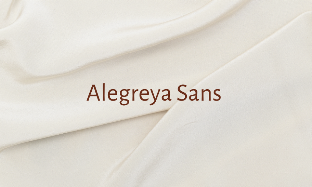
Why it is best Light font: Alegreya Sans is known for its dynamic and varied rhythm which facilitates better reading flow. This humanist sans-serif typeface supports a wide range of Latin-based languages, making it versatile for international use.
2. Aleo

Why it is best Light font: Aleo is a slab serif font with a contemporary twist. It features a semi-rounded design that enhances readability while adding a warm and approachable feel to the text. Its well-balanced structure helps in maintaining clarity even in dense blocks of text.
3. Balgin
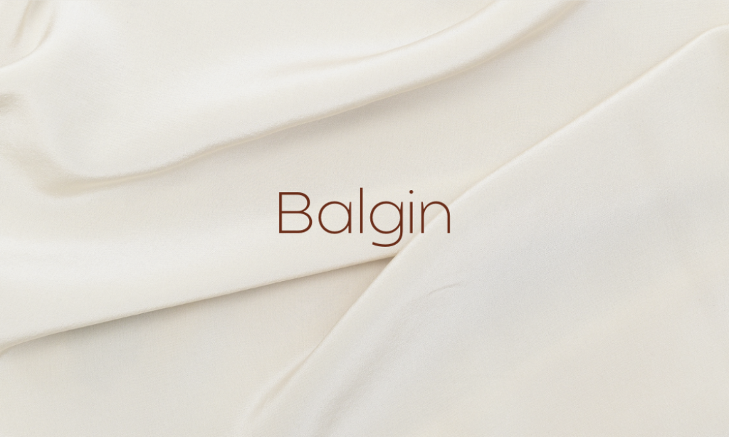
Why it is best Light font: Balgin brings a modern and elegant vibe to any design. This serif font is characterized by its sharp contrasts and high legibility, making it excellent for both headlines and body text where clarity is crucial.
4. Cabin

Why it is best Light font: Cabin is a humanist sans serif with a touch of modernism. Its open apertures and clear letter shapes ensure that it remains highly legible in a variety of sizes, which is ideal for digital and print media.
5. Cormorant Garamond
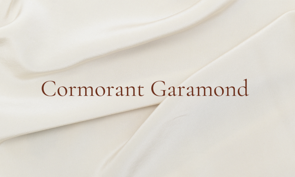
Why it is best Light font: Inspired by the classic Garamond typeface, Cormorant Garamond has been adapted for enhanced readability on modern displays. It features increased height and slightly condensed letters, making it perfect for longer texts.
6. Crimson Pro
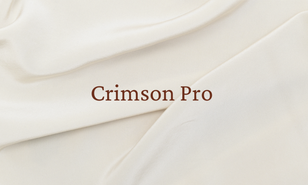
Why it is best Light font: This font is a workhorse for text-heavy documents due to its excellent readability and elegant style. Crimson Pro is designed to perform well on low-resolution screens and print, thanks to its well-crafted letterforms and moderate contrast.
7. Eczar

Why it is best Light font: Eczar is designed for expressive display typography where both personality and readability are important. The font features wide proportions and an increased x-height, which improves legibility at smaller sizes.
8. Lato

Why it is best Light font: Lato is a sans-serif typeface family designed with corporate communication in mind. Its semi-rounded details and strong structure preserve readability at various sizes, making it suitable for both web and print.
9. Libre Baskerville
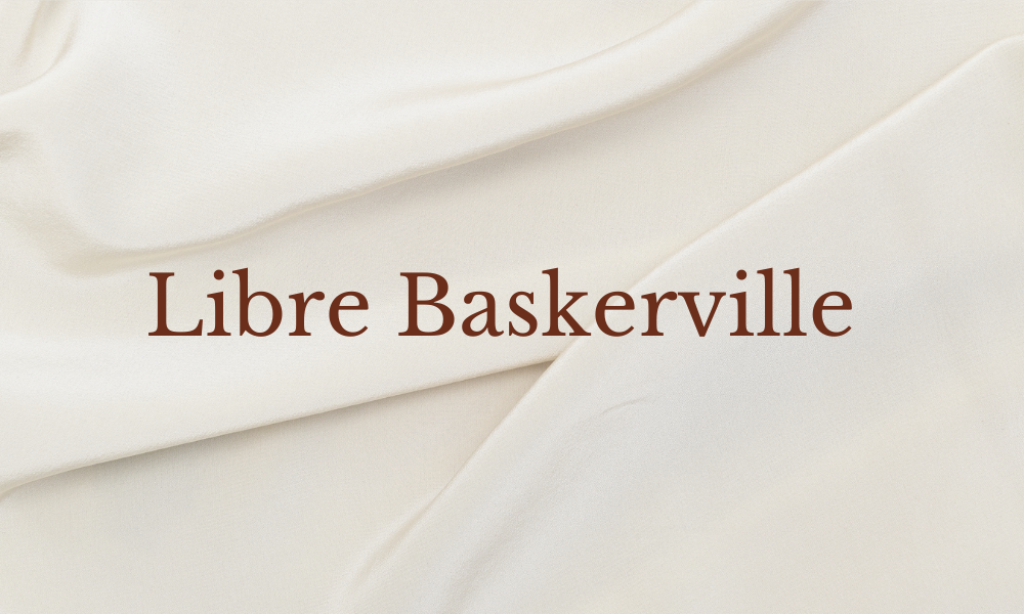
Why it is best Light font: Designed specifically for electronic display, Libre Baskerville is an update of the classic Baskerville design. It has optimized proportions and an open typeface, ensuring excellent readability in digital formats.
10. Montserrat
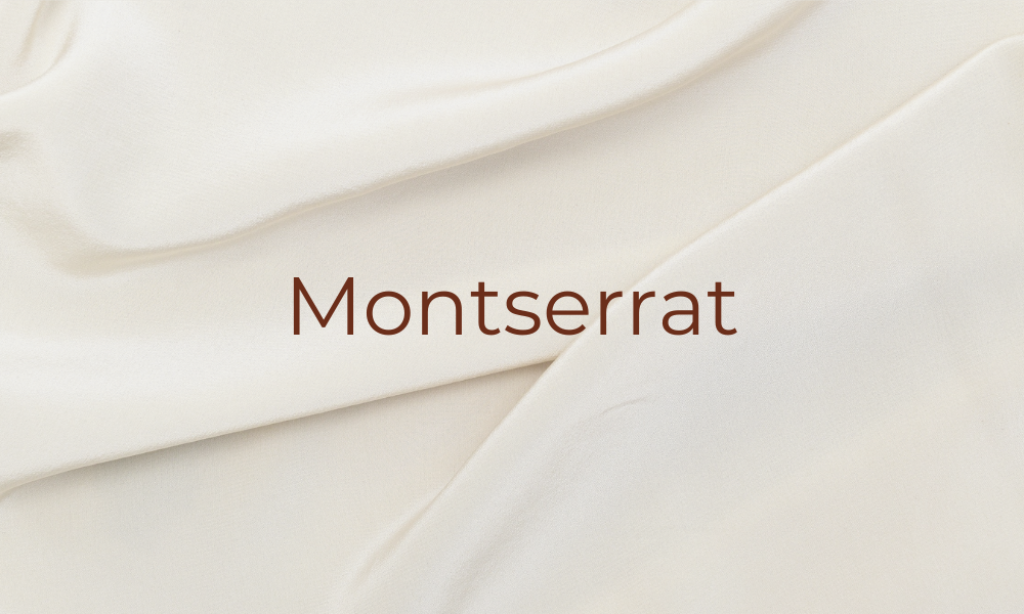
Why it is best Light font: Montserrat offers geometric beauty and uniformity, making it highly readable and incredibly versatile. Its clean, modern lines are effective in large displays and small texts.
11. Neue Montreal

Why it is best Light font: Neue Montreal is a geometric sans-serif font that stands out for its clarity and simplicity. Its uniform line width and balanced proportions make it easy to read in any size and context.
12. Nunito

Why it is best Light font: Nunito is a well-balanced sans-serif with rounded terminals, which enhances its readability. The font is especially good for user interfaces where clarity and legibility are key.
13. Poppins

Why it is best Light font: Poppins is a geometric sans-serif that strikes a balance between functional texts and expressive headings. Its evenly-spaced characters and clear-cut shapes promote readability and clean appearance.
14. Quicksand
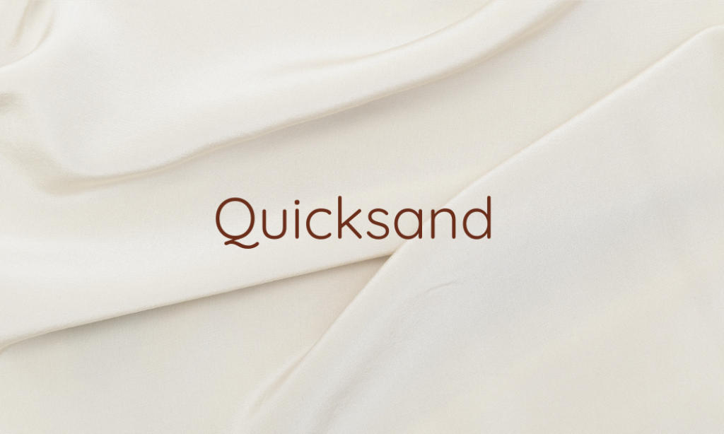
Why it is best Light font: Quicksand is a display sans serif with rounded terminals. Its clear and open forms make it easy to read at small sizes, which is perfect for captions and mobile screens.
15. Raleway

Why it is best Light font: Raleway is an elegant sans-serif typeface family intended for titles and headers. It features a large x-height, which enhances its readability across various applications and screen sizes.