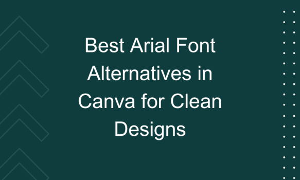
Arial is a classic choice, known for its clean and clear style, but sometimes, a little variety can make your projects stand out even more. Whether you’re designing a business presentation, a marketing flyer, or a social media post, finding the right font can truly transform your creation. In this article, we explore 16 of the best Arial font alternatives that you can use in Canva to keep your designs looking sleek and professional. These fonts not only maintain the simplicity and readability of Arial but also add a touch of personality to make your work shine.
What we cover
1. Arimo
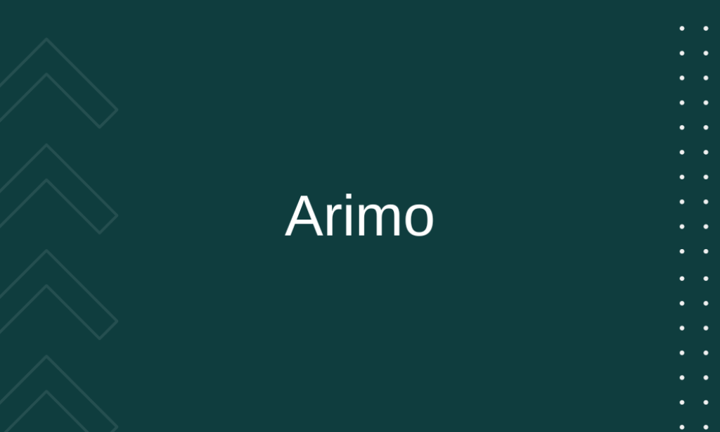
Why it is best Arial alternative: Arimo offers a crisp, modern look with characteristics similar to Arial but with wider letter spacing and cleaner lines. It’s excellent for both digital screens and print. Its clarity and simplicity make it ideal for professional presentations and documents where readability is key.
2. Avenir
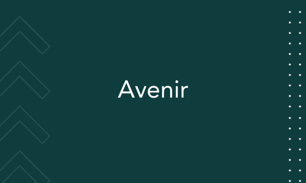
Why it is best Arial alternative: Avenir, meaning ‘future’ in French, carries a more geometric design than Arial, which provides a more contemporary aesthetic. Its clean and rounded lines make it approachable and versatile for branding and advertising.
3. Proxima Nova
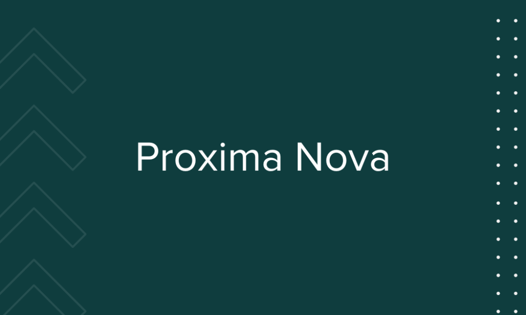
Why it is best Arial alternative: Proxima Nova bridges the gap between typefaces like Futura and Akzidenz Grotesk. It features a geometric appearance with a humanistic touch.
4. Open Sans
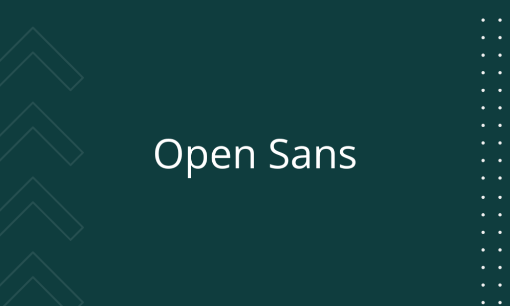
Why it is best Arial alternative: Open Sans is known for its neutral and friendly appearance, making it extremely adaptable for web and print. It’s designed for legibility across print, web, and mobile interfaces, making it universally versatile.
5. Lato

Why it is best Arial alternative: Lato is a sans-serif typeface family that means “Summer” in Polish. It was designed with corporate use in mind, making it perfect for a professional setting. The semi-rounded details of the letters give Lato a feeling of warmth, while the strong structure provides stability and seriousness.
6. Montserrat
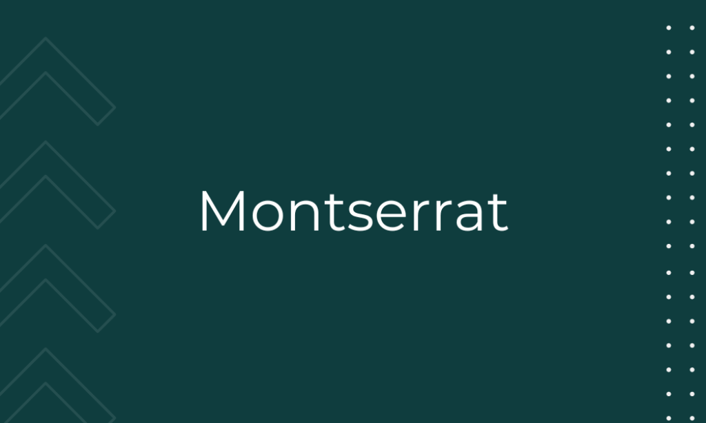
Why it is best Arial alternative: Montserrat was inspired by old posters and signs in the traditional Montserrat neighborhood of Buenos Aires. It brings a unique urban vibe to any design. Its geometric style and diverse weight options make it highly versatile for creative and dynamic layouts.
7. Roboto

Why it is best Arial alternative: Roboto offers a mechanical skeleton with friendly and open curves. It balances natural reading rhythms, which makes it quite harmonious for long texts. Its dual nature makes it both approachable and efficient for UI, UX, and text-heavy documents.
8. PT Sans
Why it is best Arial alternative: PT Sans is based on Russian sans serif types of the second part of the 20th century but adapted for the modern digital age. It’s designed to work well in user interfaces and to be comfortable for reading, with a wide range of weights.
9. Helvetica
Why it is best Arial alternative: Helvetica is perhaps the most quintessential sans-serif, known for its high readability and clean, no-frills style. Its popularity stems from its neutrality and ability to work in any context, from corporate to casual.
10. Nunito

Why it is best Arial alternative: Nunito is a well-balanced sans serif with rounded terminals, which gives it a soft, friendly vibe without losing professionalism. It’s perfect for everything from children’s materials to professional presentations needing a touch of gentleness.
11. Source Sans Pro
Why it is best Arial alternative: Source Sans Pro was Adobe’s first open-source typeface, designed for user interfaces and extended texts. It’s optimized for legibility across print, web, and mobile interfaces.
12. Fira Sans
Why it is best Arial alternative: Originally designed for Mozilla, Fira Sans is widely recognized for its clarity and robustness in digital displays. It’s particularly good for tech-related projects and websites due to its modern and approachable character.
13. Varela Round

Why it is best Arial alternative: Varela Round is known for its soft, rounded corners which add a gentle, inviting tone to texts. It’s perfect for websites, mobile apps, and UI designs where a touch of friendliness is needed.
14. Muli
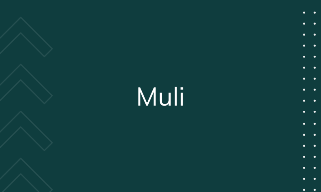
Why it is best Arial alternative: Muli is a minimalist sans-serif designed to work well in both text-heavy environments and simple displays. Its sleek and clean lines provide an excellent alternative for digital and print projects that require clarity and efficiency.
15. Oswald
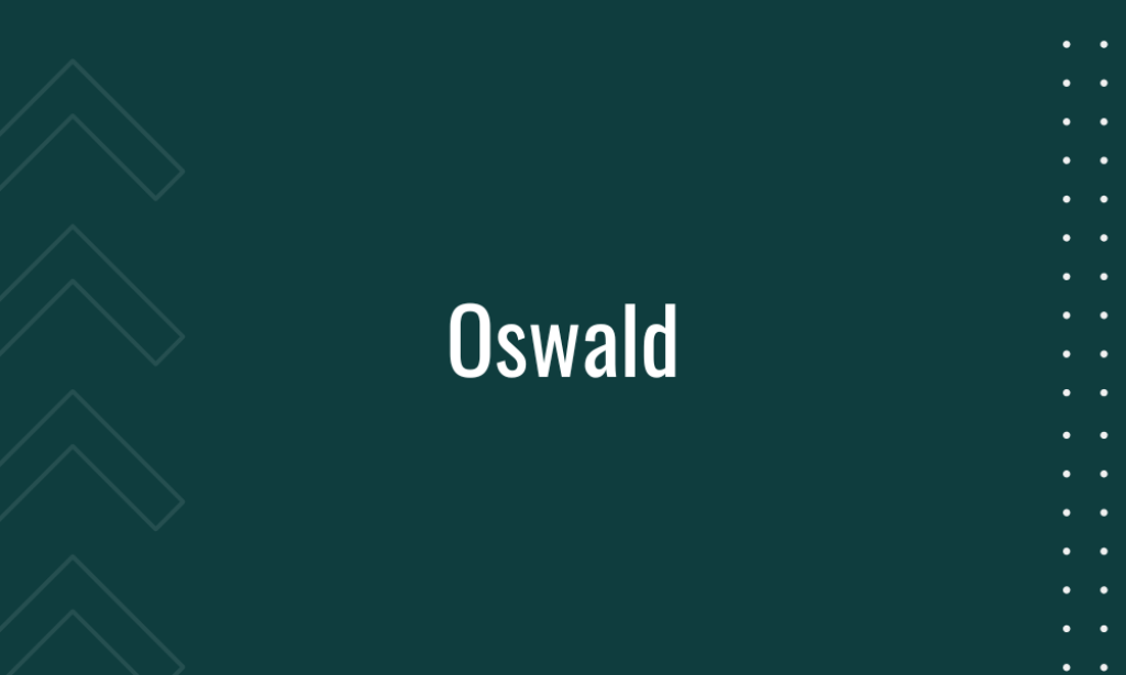
Why it is best Arial alternative: Oswald has been adapted and reworked for the digital age, inspired by the classic gothic typeface style. It is great for titles and headers when you need something impactful yet straightforward.
16. Cabin

Why it is best Arial alternative: Cabin incorporates modern proportions, optical adjustments, and some elements of the geometric sans. It offers a warm, readable typeface that works well for almost any text-heavy document or presentation. The balance between sharp angles and soft curves offers excellent readability and modern flair.