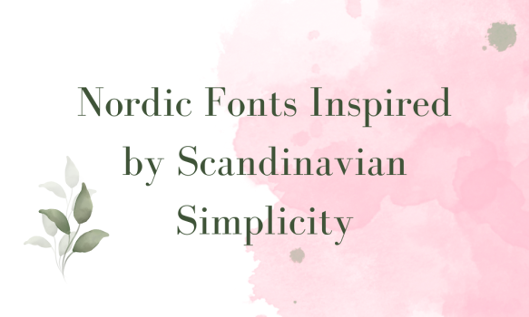
Scandinavian design is loved around the world for its cleanliness and minimalism, and Nordic fonts perfectly capture this spirit. These fonts, characterized by simple lines and uncluttered aesthetics, bring a sense of calm and readability to any design. They are not only beautiful but also highly functional, making them a favorite among graphic designers and typographers. In this article, we explore a selection of Nordic fonts that embody the clarity, functionality, and minimalism prized in Scandinavian design, making them excellent choices for projects aiming to capture this aesthetic.
What we cover
1. Arial
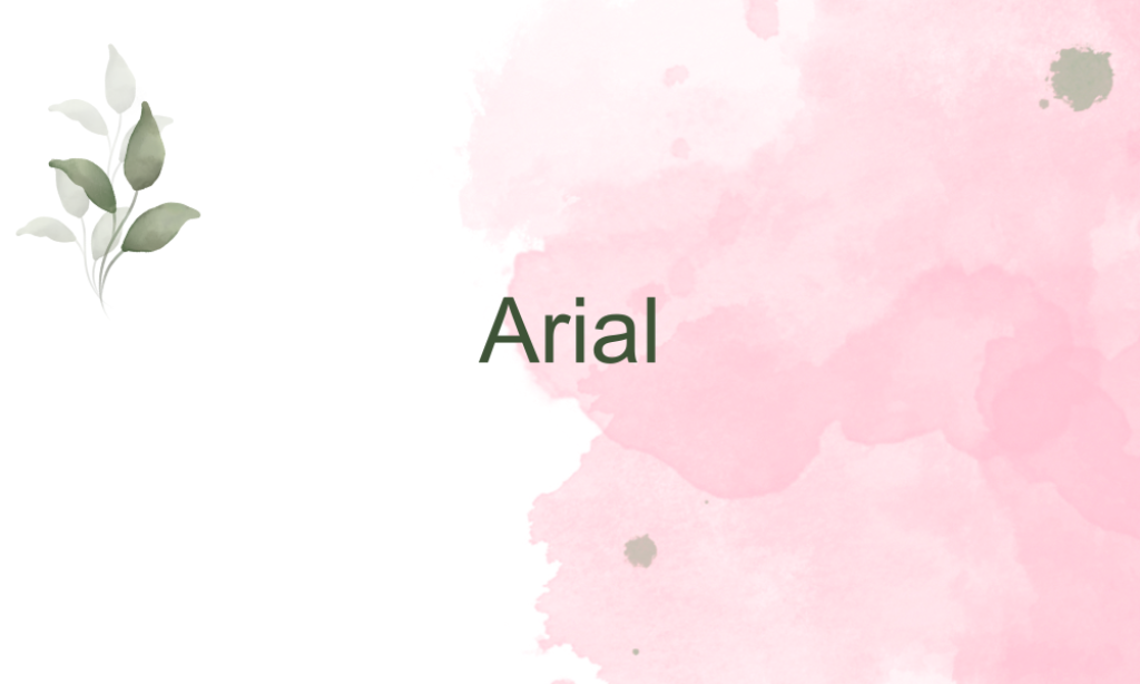
Why it is Nordic font: Arial is a sans-serif font known for its clarity and versatility. Its straightforward, no-frills design makes it align well with the Nordic emphasis on functionality and minimalism.
2. Avenir
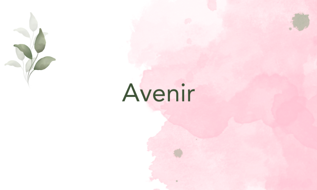
Why it is Nordic font: Avenir, which means ‘future’ in French, boasts a clean and modern geometric design. Its balanced proportions reflect the Nordic preference for harmony and efficiency in typography.
3. Bodoni FLF
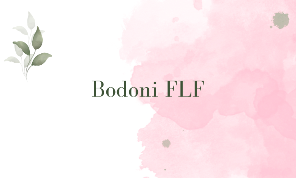
Why it is Nordic font: While Bodoni FLF is a serif font with distinct contrasts between thick and thin strokes, it is included for its precise, elegant structure which reflects the meticulous qualities of Scandinavian design.
4. Calibri
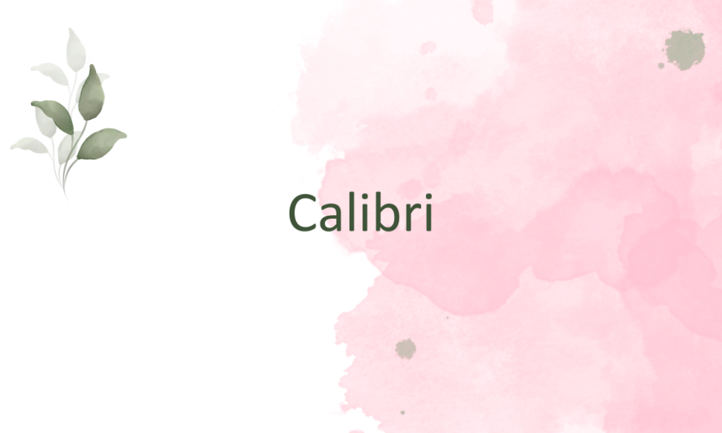
Why it is Nordic font: Calibri is a soft, friendly sans-serif with warm, rounded characters, embodying the cozy and humane aspect of Nordic design. It’s straightforward and readable, which is central to Scandinavian aesthetics.
5. Futura

Why it is Nordic font: Futura is a geometric sans-serif, perfect for conveying the simplicity and functionality that Nordic design is known for. Its clean and efficient shapes capture the modernist ethos central to the Nordic style.
6. Georgia Pro
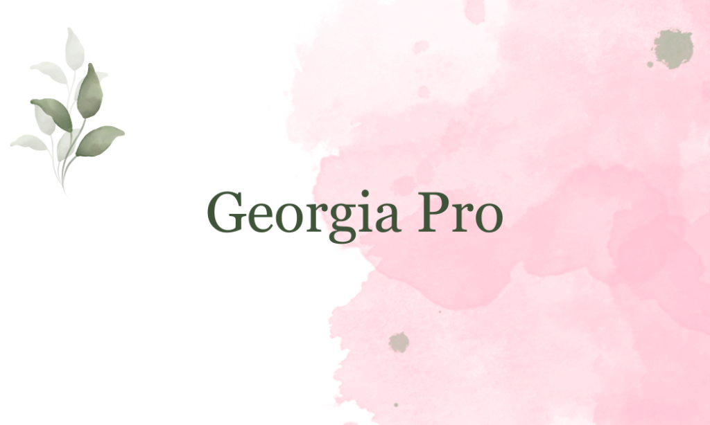
Why it is Nordic font: Georgia Pro is a serif font designed for clarity on digital screens. Its refined readability and elegance bring a subtle, functional beauty, much like the understated elegance in Nordic design.
7. Gotham
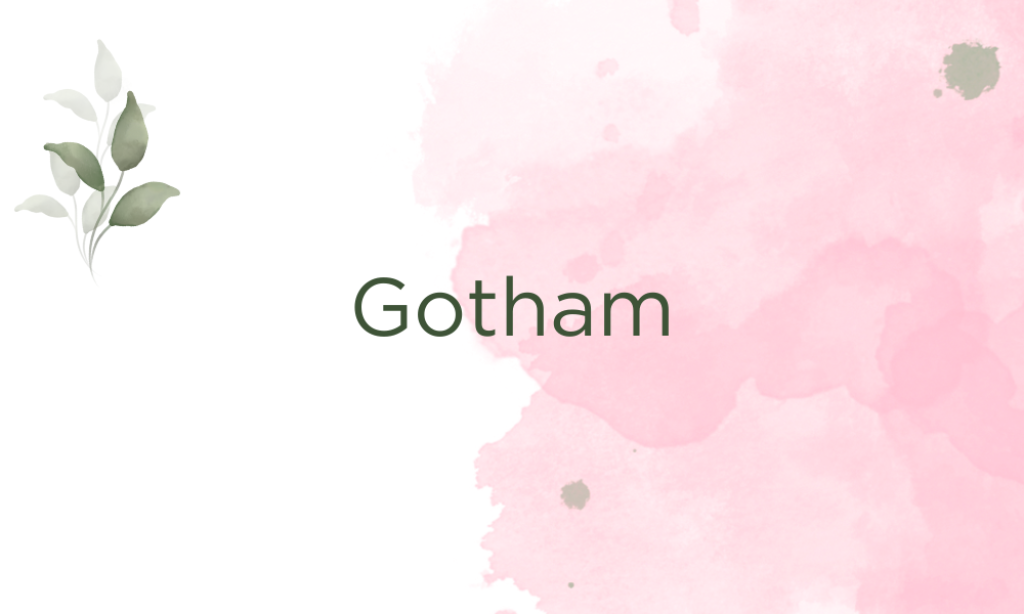
Why it is Nordic font: Gotham is a highly functional and geometric sans-serif that resonates with the modern and straightforward style of Nordic typography. Its professional and clean appearance makes it a suitable choice.
8. Helvetica
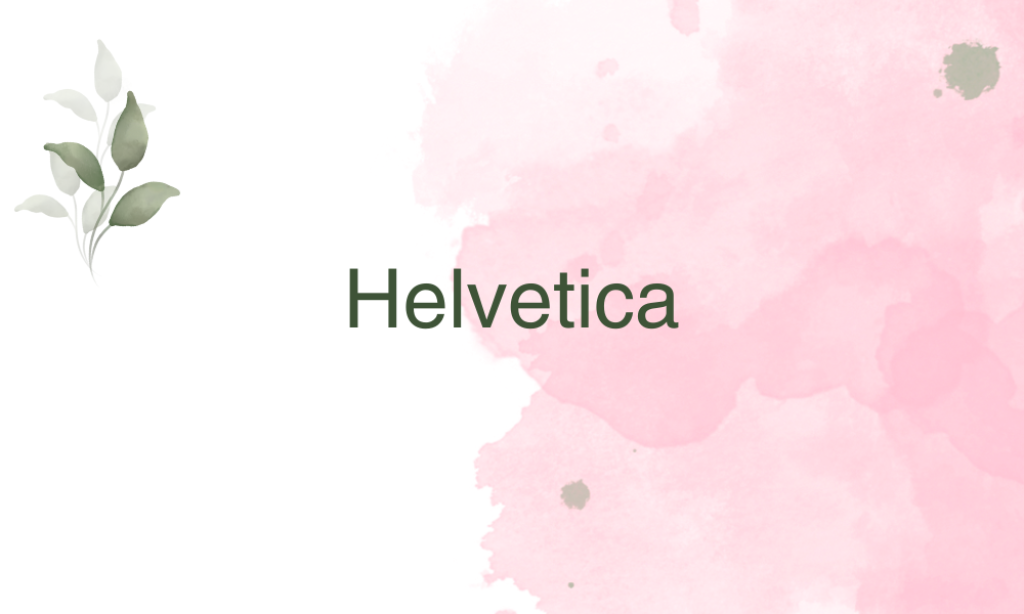
Why it is Nordic font: Perhaps the epitome of Swiss typography, which closely aligns with Nordic design principles, Helvetica is famous for its neutrality and clarity, making it a staple in minimalist design frameworks.
9. Lato
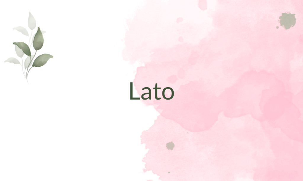
Why it is Nordic font: Lato is a humanist sans-serif known for its semi-rounded details that give a feeling of warmth. It combines functionality with a friendly appearance, mirroring the accessible and open spirit of Nordic design.
10. Libre Baskerville
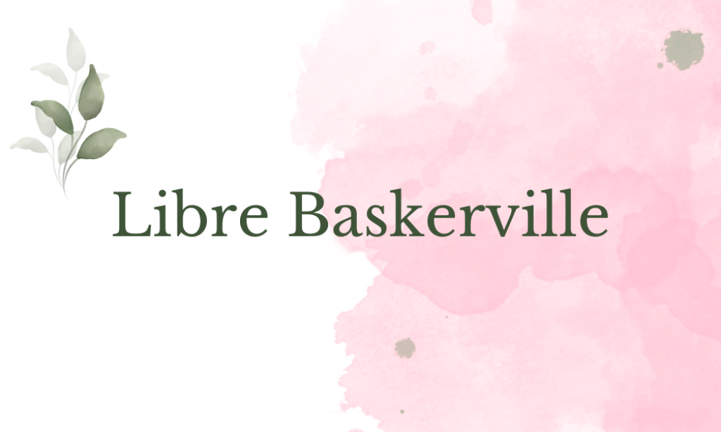
Why it is Nordic font: Libre Baskerville is a serif font that is optimized for body text with high readability. It’s included for its classical proportions and clean appearance, which bring a timeless elegance.
11. Montserrat
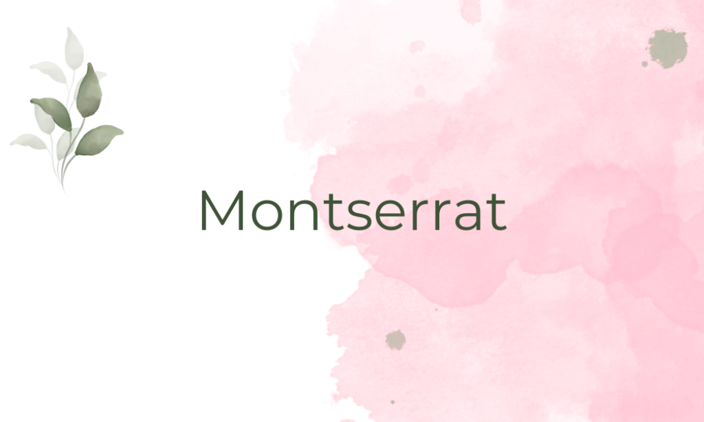
Why it is Nordic font: Montserrat’s geometric lines and urban style are inspired by traditional signage in the Montserrat neighborhood of Buenos Aires. Its clean, block-like simplicity reflects the functional aspect of Nordic design.
12. Open Sans
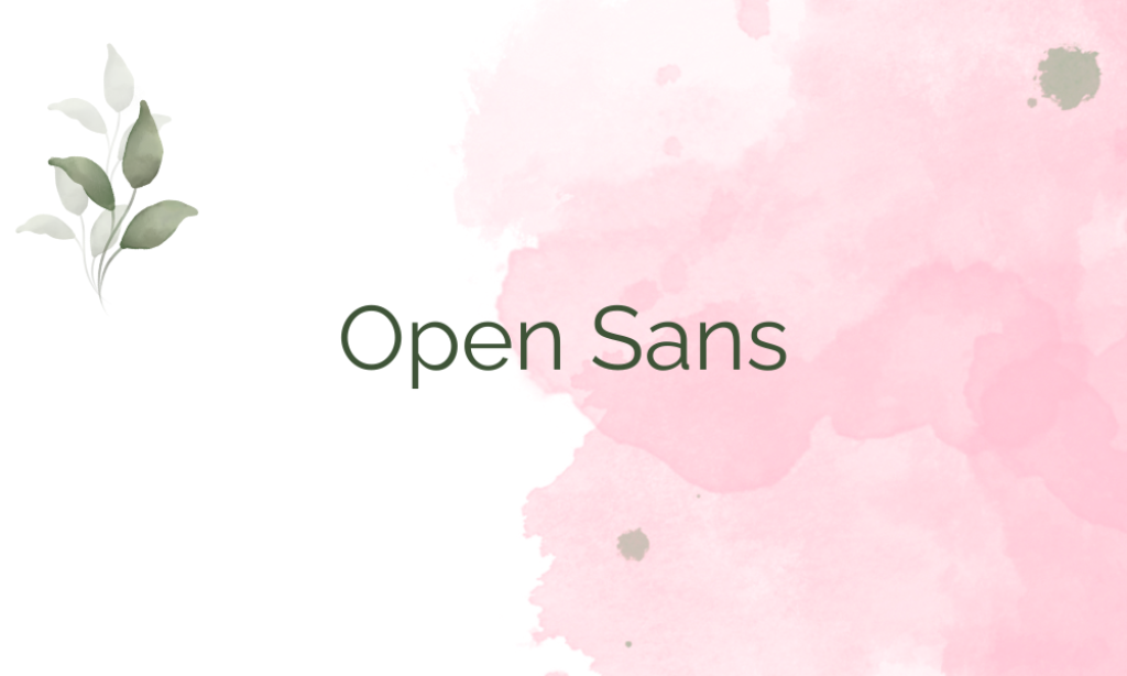
Why it is Nordic font: Open Sans is characterized by a neutral yet friendly appearance, making it extremely versatile and fitting for the Scandinavian style which favors readability and simplicity.
13. Playfair Display
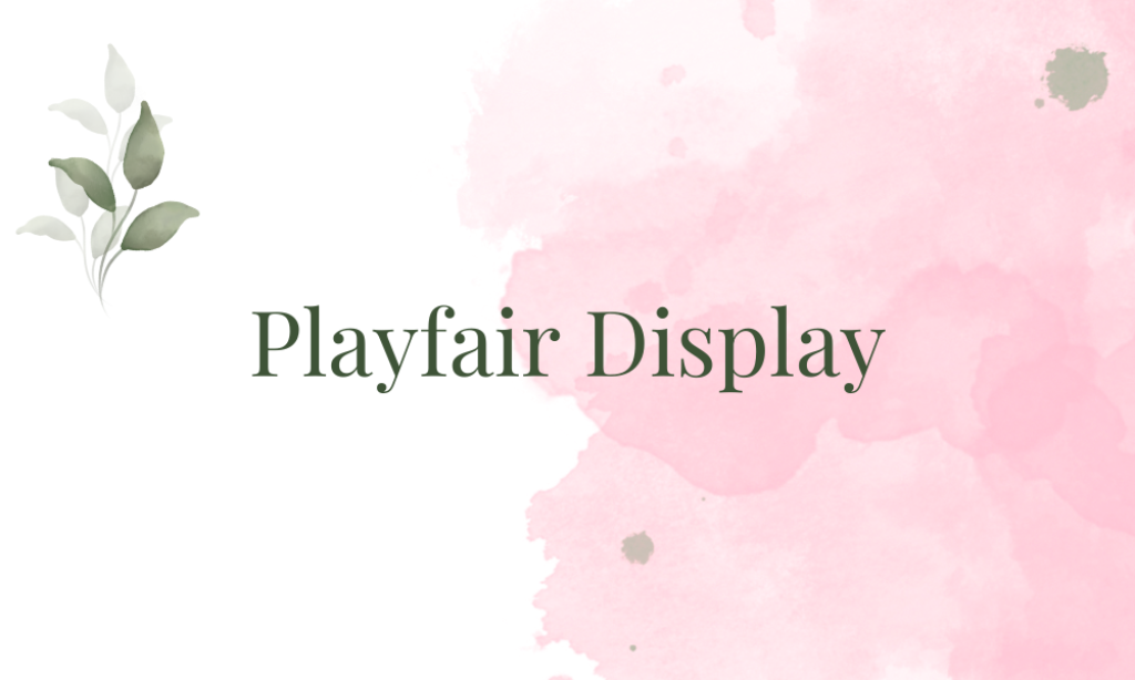
Why it is Nordic font: With fine details and an upscale look, Playfair Display adds a touch of luxury while still aligning with Nordic minimalism due to its clean finish and high legibility.
14. Proxima Nova
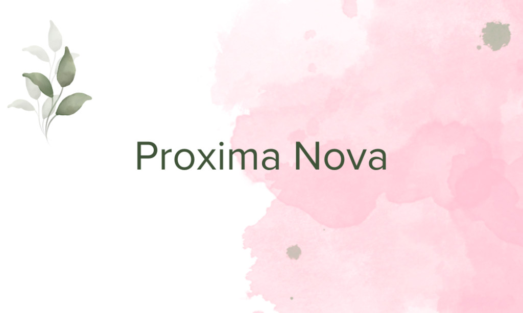
Why it is Nordic font: Proxima Nova blends modern proportions with a geometric appearance, making it clean, straightforward, and very functional, which are key components of Nordic design.
15. Raleway
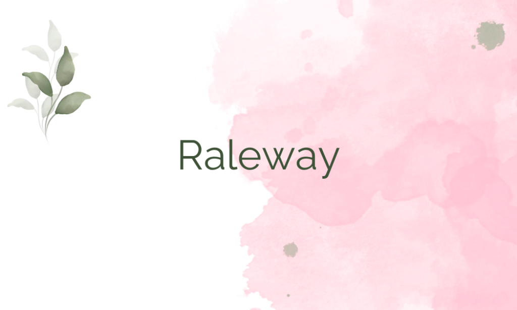
Why it is Nordic font: Raleway is an elegant sans-serif with a very clean, minimal design. It is perfect for use in a minimalist design setting that requires a touch of sophistication without complexity.
16. Roboto

Why it is Nordic font: Roboto offers a mechanical skeleton with largely geometric forms. It balances classic style with innovation, much like the Nordic approach to design.
17. Source Sans Pro
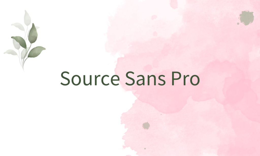
Why it is Nordic font: As Adobe’s first open-source typeface, Source Sans Pro was designed to be highly legible in digital environments, perfectly mirroring the Nordic emphasis on functionality and clarity.
18. Tahoma

Why it is Nordic font: Tahoma is known for its tight letter spacing and high readability, which make it a practical choice for on-screen use, aligning well with the straightforward, functional ethos of Nordic design.
19. Times New Roman
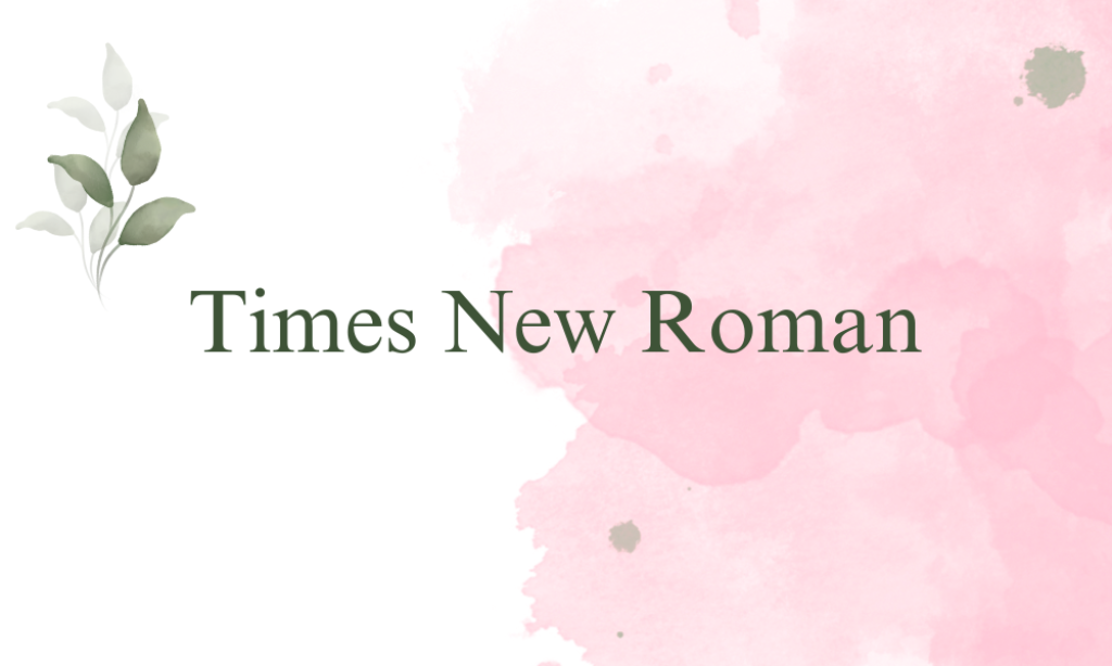
Why it is Nordic font: Times New Roman, while traditional, is known for its classic, clean lines and excellent legibility, making it a surprisingly fitting choice for formal applications within a minimalist Nordic style.
20. Verdana Pro
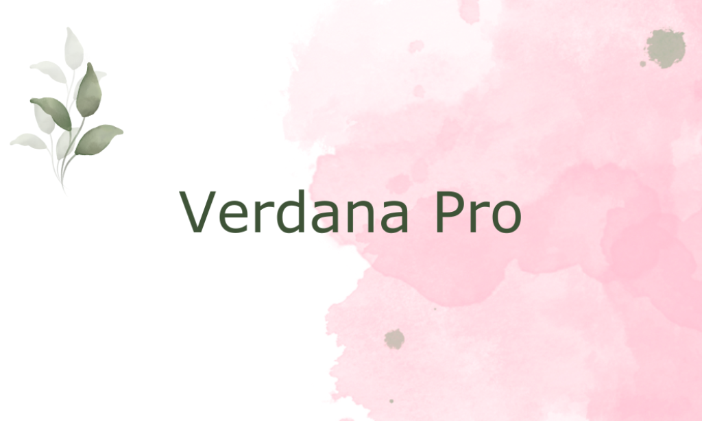
Why it is Nordic font: Designed specifically for high readability on low-resolution screens, Verdana Pro’s robust character constructions and ample spacing echo the Nordic emphasis on clarity and functionality.