As we dive into the vibrant and unmistakably nostalgic world of early 2000s design, the resurgence of Y2K aesthetics in fashion, music, and digital art has sparked a renewed interest in the iconic fonts that defined this era. The Y2K aesthetic, known for its futuristic curves, metallic textures, and playful embrace of technology, offers a unique blend of optimism and digital dreaminess that is now being celebrated once again. In this article, we’ll explore the best Y2K fonts available on Canva, each carefully selected to help you channel the spirit of the millennium’s dawn into your graphic design projects.
What we cover
1. Bebas Neue
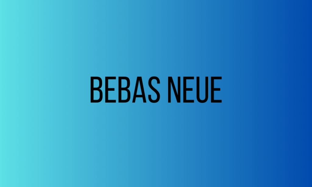
Why It’s Y2K: Bebas Neue’s clean, all-caps sans-serif design captures the Y2K era’s fascination with minimalism and digital clarity. Its boldness makes it perfect for headlines that demand attention, reminiscent of early 2000s tech ads and digital interfaces.
2. Black Gold Display
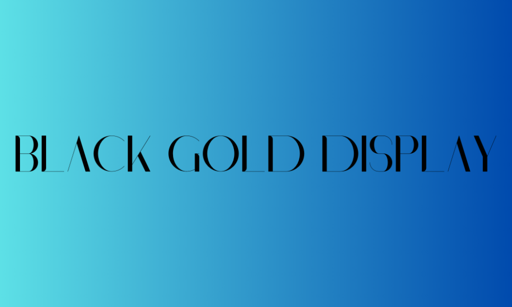
Why It’s Y2K: With its sophisticated serif design, Black Gold Display brings a touch of luxury and high-end fashion that became popular in the late ’90s and early ’00s. It evokes the era’s glam and the emerging web’s elegance, making it ideal for designs that aim to blend retro luxury with modern crispness.
3. Blinker
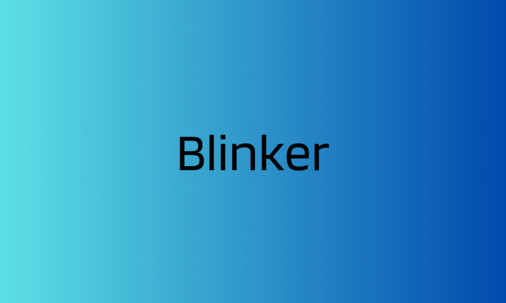
Why It’s Y2K: The geometric shapes and uniform thickness of Blinker echo the Y2K era’s love for simplicity and futurism in digital design. Its clean lines and modern look make it suitable for projects that require a touch of the new millennium’s optimistic outlook.
4. RQND Pro Ultrawide
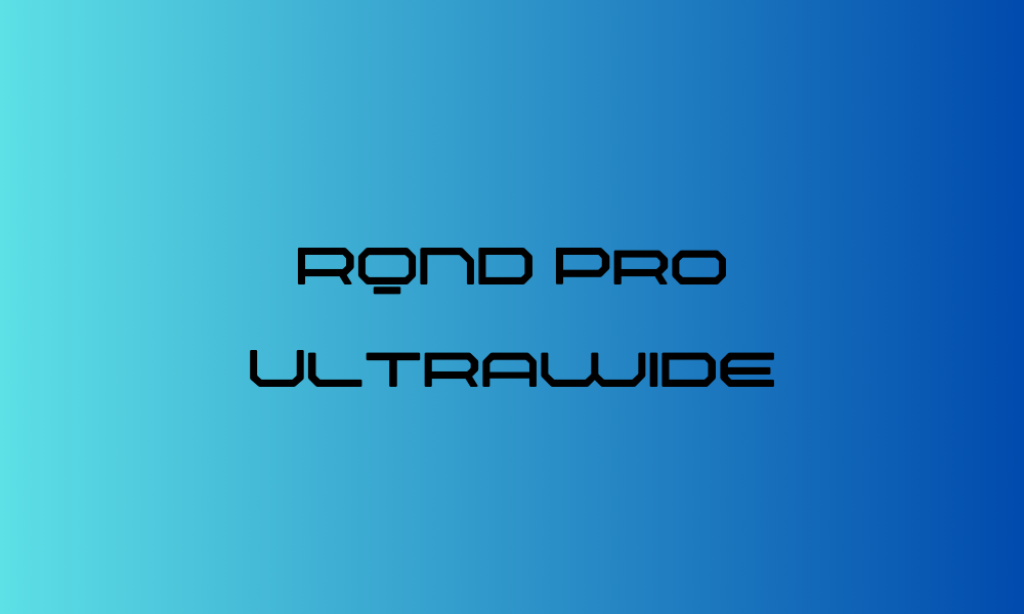
Why It’s Y2K: The ultra-wide stance of RQND Pro Ultrawide reflects the Y2K fascination with space, exploration, and a broader perspective of the digital world. Its extended characters suggest the era’s push towards innovation and the unknown future.
5. Mokoto Glitch 1
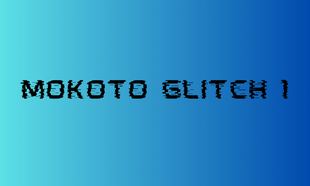
Why It’s Y2K: Embodying the digital experimentation and the occasionally imperfect technology of the Y2K era, Mokoto Glitch 1 is perfect for projects that channel a sense of digital disruption, cyberpunk aesthetics, and the glitch art that began to emerge.
6. Gyanko
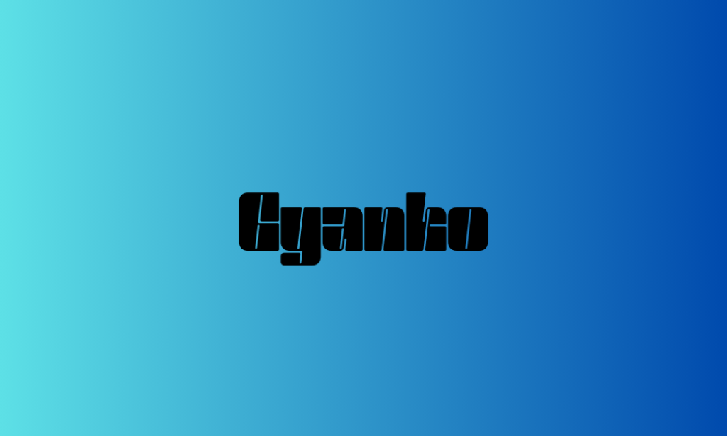
Why It’s Y2K: Gyanko, with its playful and somewhat quirky design, mirrors the Y2K era’s embrace of fun, personality-driven fonts in web design and digital media. It’s reminiscent of the friendly interfaces that welcomed many to the digital age.
7. Retropix
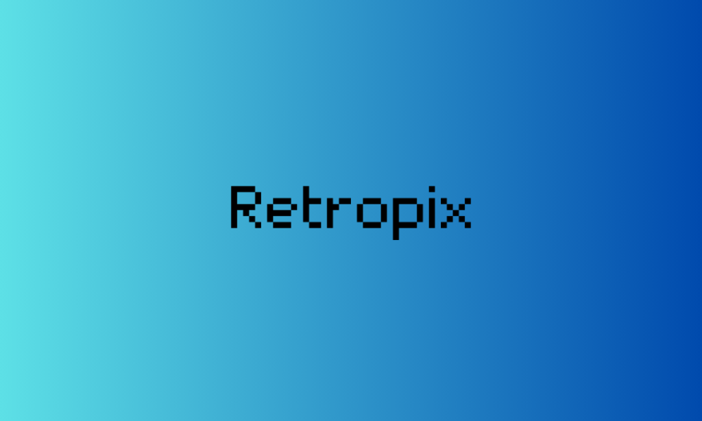
Why It’s Y2K: Retropix captures the pixel art that dominated early web graphics, video games, and digital art of the late ’90s and early ’00s. Its pixelated style is a nod to the roots of digital culture, making it essential for nostalgic Y2K-themed projects.
8. VT 323
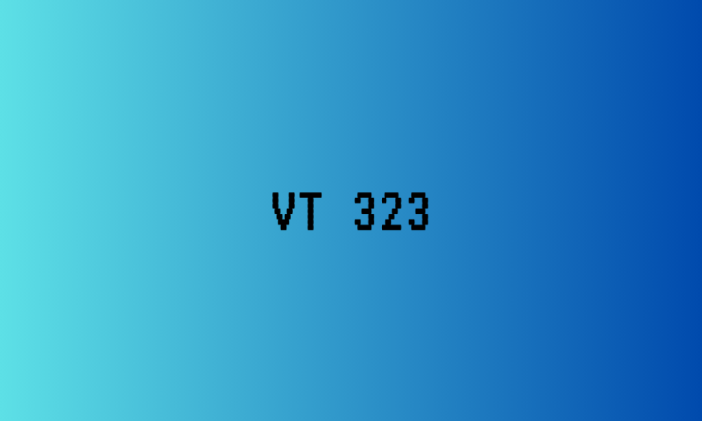
Why It’s Y2K: The monospaced, typewriter-like appearance of VT 323 brings back the DIY ethos of early web designs and zine culture from the Y2K period. It’s perfect for evoking the handcrafted, personal feel of early online communities.
9. Zico Display Inline
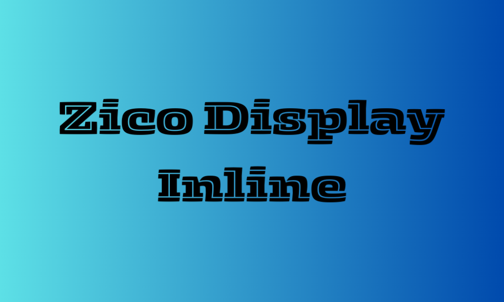
Why It’s Y2K: Zico Display Inline, with its inline detailing and bold presence, harks back to the era’s love for depth and dimension in text, often seen in logos, gaming, and digital media. It’s dynamic yet playful, fitting the Y2K vibe perfectly.
10. Ayr Saturday Night Interlock Regular
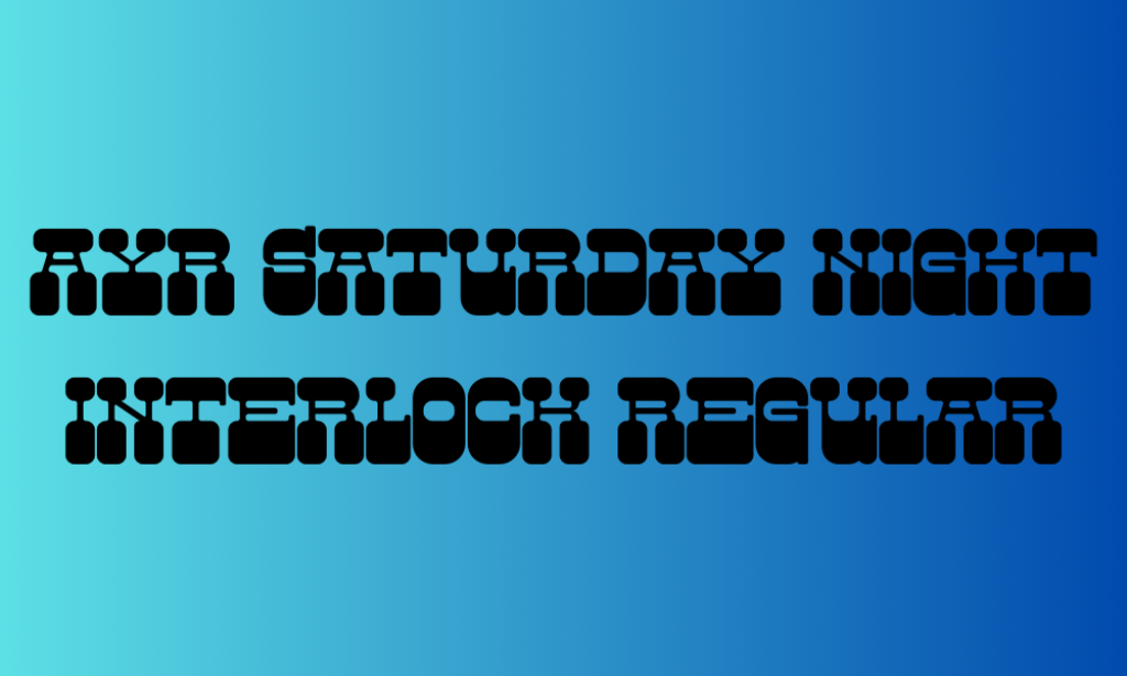
Why It’s Y2K: This font captures the party spirit of the Y2K era, with its interlocking design reminiscent of dance club logos and music album art from the time. It’s all about fun, connectivity, and the social buzz that defined the turn of the millennium.
11. Pixelion
Why It’s Y2K: Pixelion blends the digital pixel look with a modern design, reflecting the transition from the rugged, pixelated graphics of the ’90s to the smoother, more sophisticated digital imagery of the 2000s. It symbolizes the evolution of digital design aesthetics.
12. Kindred Youth
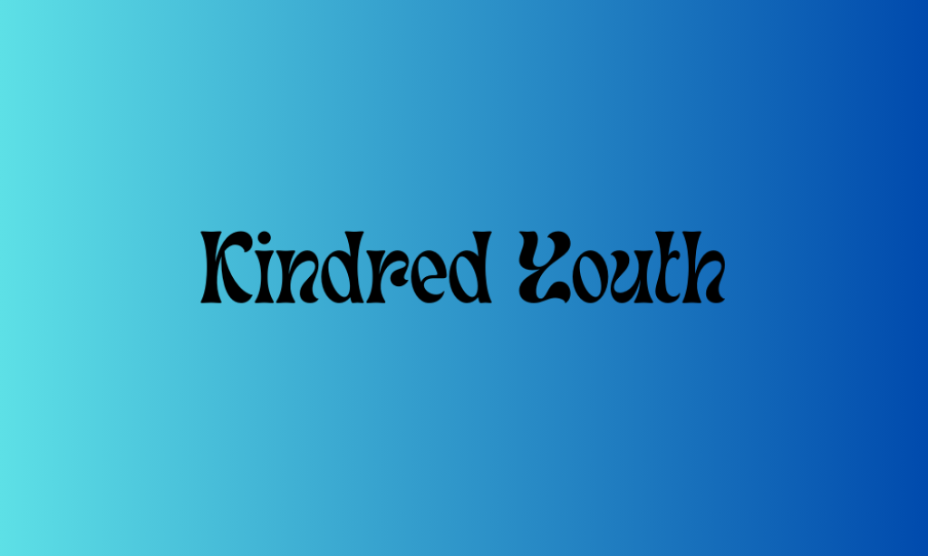
Why It’s Y2K: Kindred Youth’s handwritten style adds a personal touch that contrasts with the digital perfection, reminiscent of the personal blogs and handmade web graphics that became popular as the internet became more accessible.
13. TT Milks Casual Outline Shadow
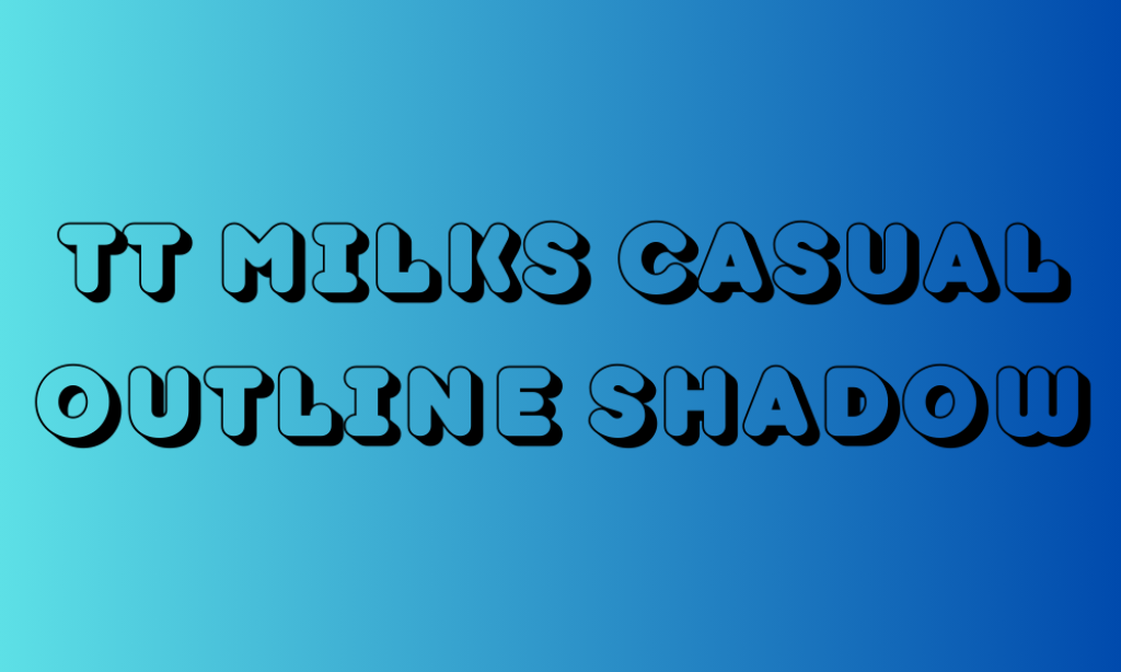
Why It’s Y2K: Its geometric, structured form captures the architectural and design innovations of the era, echoing the Y2K focus on the future and the blending of form and function in urban design.
14. ITC Magnifico Nighttime
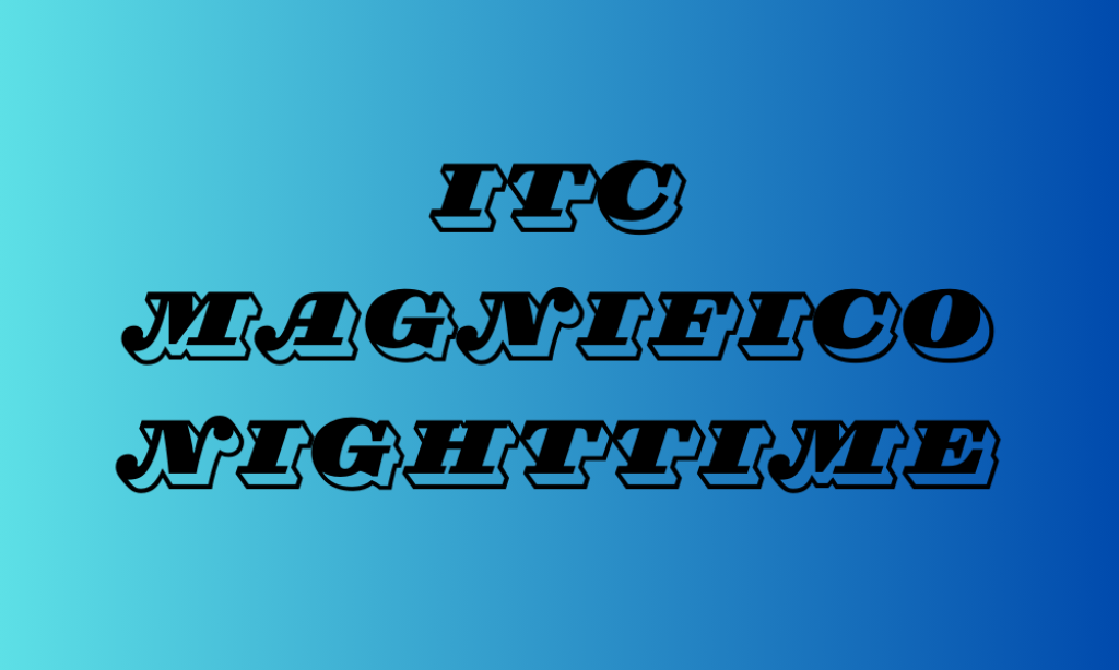
Why It’s Y2K: The decorative flair and sophistication of ITC Magnifico Nighttime recall the extravagant and bold design choices prevalent in late ’90s and early ’00s nightlife culture, fashion, and luxury branding.
15. Cyberjunkies
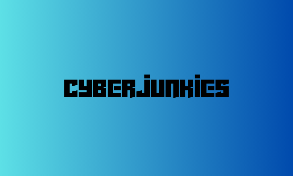
Why It’s Y2K: Cyberjunkies embodies the edgy, rebellious side of Y2K culture, drawing from cyberpunk and underground tech scenes. Its bold, unconventional look captures the era’s exploration of digital identity and virtual realities.