Are you looking to make your Facebook posts stand out and grab more attention? Choosing the right font can be a game-changer. With the right font, your message can pop off the page, making it more likely to catch the attention and interest of your followers. In this article, we’ve rounded up the 15 best fonts that are perfect for boosting the visibility of your Facebook posts. Let’s dive in and discover the fonts that can transform your content! These fonts each bring unique advantages to Facebook posts, making them more noticeable and engaging in different ways.
What we cover
1. Arial
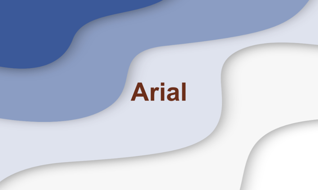
Why It’s Great for Facebook: Known for its clarity and legibility, Arial is a sans-serif font that works well on digital platforms. It’s a popular choice because it’s familiar to most users, making it instantly readable, which is key for catching the eye in a fast-scrolling environment like Facebook.
2. Courier New

Why It’s Great for Facebook: This monospaced serif font has a typewriter style that offers a nostalgic or vintage feel, making it stand out in modern social media feeds. It’s best used for highlighting quotes or creating a distinctive, attention-grabbing headline.
3. Cardo
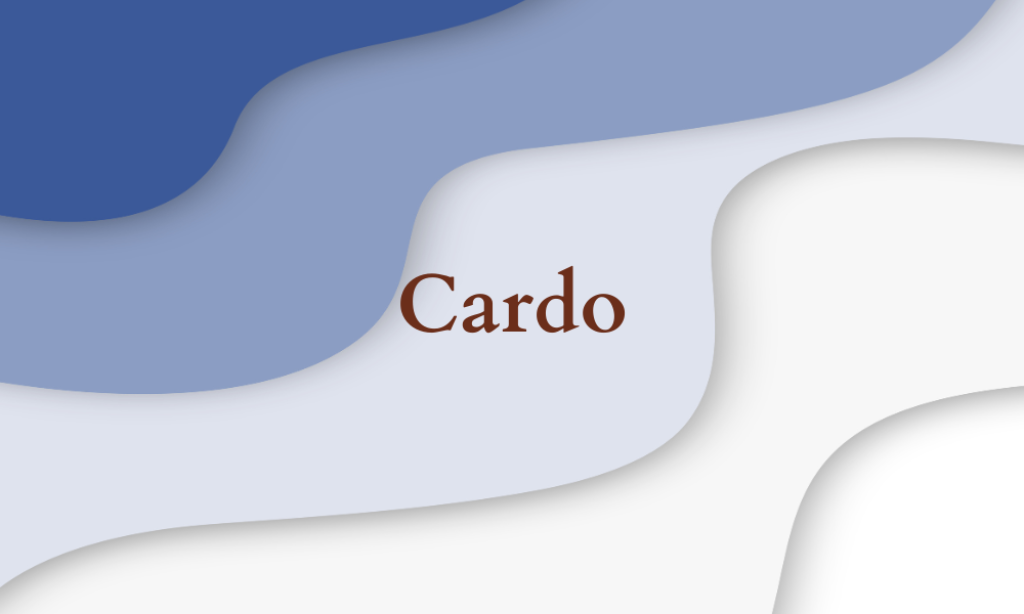
Why It’s Great for Facebook: Cardo is a serif font that is particularly tailored for use in academic texts. Its elegant proportions and distinct serifs make it stand out in a sea of simpler modern fonts often seen on social media. Including Cardo in your typography toolkit for Facebook posts can lend a unique character to your page, enhancing visibility and engagement.
4. Futura

Why It’s Great for Facebook: A geometric sans-serif font that is both modern and efficient. Futura’s clean lines and even weighting help make posts look sleek and professional. Its distinct appearance can add a futuristic or high-end feel to graphics, which is excellent for brands aiming to project a forward-thinking image.
5. Georgia
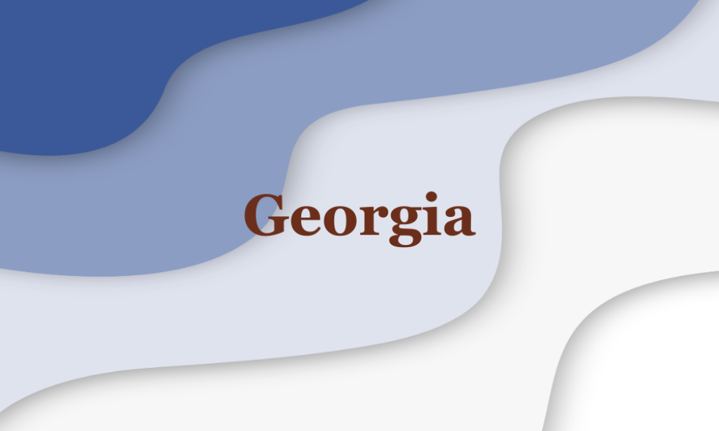
Why It’s Great for Facebook: Georgia is a serif font that’s designed to be highly readable on screens. With its elegant and slightly whimsical design, it provides a touch of sophistication to posts, which can enhance the perceived value of the content.
6. Helvetica
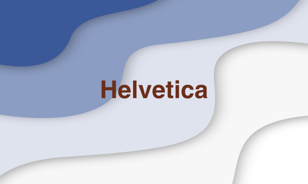
Why It’s Great for Facebook: Often cited for its neutral and clear typeface, Helvetica is versatile and widely used in branding. Its simple form and absence of frills make it incredibly legible, which is essential for quick communication on social media.
7. Lato

Why It’s Great for Facebook: Lato is a sans-serif typeface that was originally designed to be a corporate font. With its semi-rounded details, it conveys a feeling of warmth while maintaining a strong presence. It’s perfect for brands that want to appear approachable and professional.
8. Montserrat
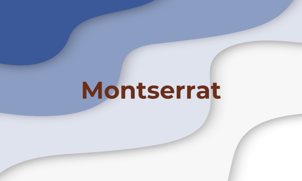
Why It’s Great for Facebook: This geometric sans-serif typeface features clean lines and modern proportions. Its boldness makes it excellent for headings and titles in Facebook posts, ensuring high visibility even on smaller displays.
9. Open Sans

Why It’s Great for Facebook: Designed with an open aperture and a neutral yet friendly appearance, Open Sans is highly legible and readable in text-heavy posts. This makes it ideal for longer updates or captions on Facebook, where clarity is crucial.
10. Oswald
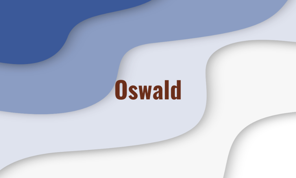
Why It’s Great for Facebook: Modified from the classic gothic types, Oswald is great for digital platforms as it has been adapted for better fit on screens. Its taller and narrower letters allow for more impactful headlines without taking up too much space.
11. Proxima Nova
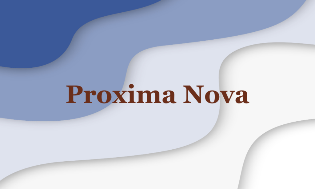
Why It’s Great for Facebook: Bridging the gap between typefaces like Futura and Akzidenz Grotesk, Proxima Nova is both modern and human. Its clean and professional look is versatile for any type of post, enhancing readability and aesthetic appeal.
12. Roboto

Why It’s Great for Facebook: Roboto offers a mechanical skeleton with largely geometric forms, balanced with friendly and open curves. This makes it more legible at small sizes and gives it a natural reading rhythm, suitable for mobile and desktop views.
13. Times New Roman

Why It’s Great for Facebook: As one of the most recognizable fonts in the world, Times New Roman brings a sense of credibility and formality to posts. This can be particularly effective for authoritative or serious content.
14. Univers

Why It’s Great for Facebook: Univers is a sans-serif typeface known for its clean and objective character, thanks to its uniformity and great clarity. It’s perfect for creating minimalist designs that need to communicate quickly and clearly.
15. Verdana
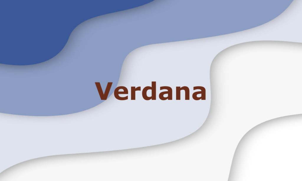
Why It’s Great for Facebook: Designed specifically for high readability on screens, Verdana features wide spacing and robust characters. It’s an excellent choice for posts aimed at older audiences or where small font sizes are unavoidable.