When creating visual content, the right font can make all the difference, especially when it comes to numbers. That’s why we’ve compiled a list of 17 Canva fonts perfect for making your numerical data stand out. These fonts are not just readable; they are designed to draw attention and enhance clarity. From bold and impactful to sleek and modern, there’s a style to suit every type of project. Each of these fonts has unique characteristics that make them suitable for making numbers prominent and legible in various applications, from technical presentations to creative visual content.
What we cover
1. Anton

Why it stands out for Numbers: Anton is an ultra-bold sans serif font. Its thick strokes make numbers highly visible and impactful, which is perfect for attention-grabbing headlines or standout statistics in large formats like posters or banners.
2. Archivo Black

Why it stands out for Numbers: As part of the Archivo-type family known for its clarity and readability, Archivo Black offers a heavyweight presence that makes numbers pronounced and easy to read, ideal for strong visual statements in presentations and reports.
3. Bebas Neue

Why it stands out for Numbers: A clean and all-caps sans serif font, Bebas Neue features tall and narrow characters that offer excellent legibility. This font is particularly effective for numeric displays in infographics or data-heavy visual content.
4. Dosis

Why it stands out for Numbers: Dosis is a rounded sans-serif font available in multiple weights. Its soft curves make it a friendly option that’s still assertive enough to ensure numbers stand out, suitable for both digital screens and print media.
5. Exo 2
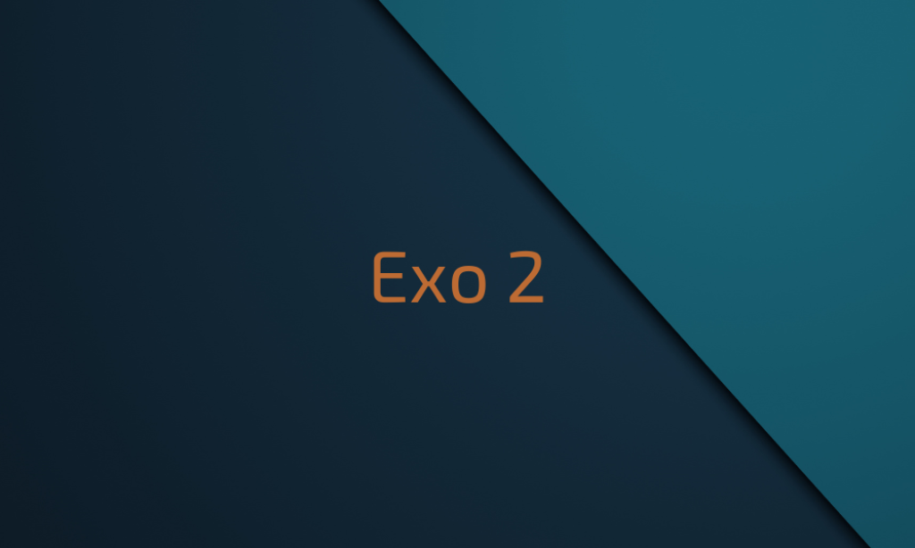
Why it stands out for Numbers: Exo 2 is a contemporary geometric sans serif font with a futuristic touch. It includes a wide range of weights, making it versatile for displaying numbers in different contexts and formats, ensuring clarity and modernity.
6. Fira Sans
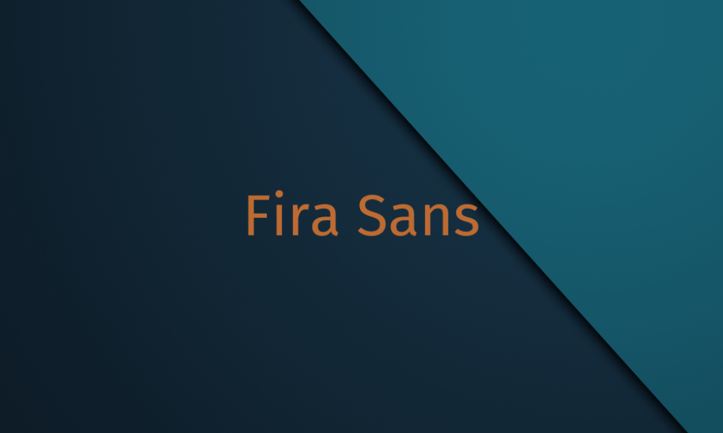
Why it stands out for Numbers: Designed with digital screens in mind, Fira Sans ensures excellent readability. Its wide range of weights from ultra-light to ultra-bold allows for dynamic number displays, making it suitable for web and mobile interfaces.
7. JetBrains Mono

Why it stands out for Numbers: A monospaced font originally designed for developers, JetBrains Mono offers uniformity and clarity, which is crucial for tabular number data and code. Its clear distinction between characters reduces reading errors, making it great for detailed data.
8. League Gothic

Why it stands out for Numbers: This condensed sans serif is tall and narrow, allowing for fitting more digits into limited spaces without losing legibility. It’s ideal for creating striking numeric headlines or footnotes in documents and posters.
9. Major Mono Display

Why it stands out for Numbers: As a monospaced display font, Major Mono Display gives a digital, typewriter-like feel, which is great for numbers that need a vintage or mechanical appearance. Its uniform spacing enhances readability in sequences of numbers.
10. Oswald

Why it stands out for Numbers: Oswald is a reworking of the classic gothic typeface style, with a bold, condensed form that makes it perfect for headlines and numeric highlights in both print and digital media.
11. Pathway Gothic One

Why it stands out for Numbers: A narrow, elongated font that is ideal for uses where space is at a premium but readability cannot be compromised. It makes numbers tall and lean, enhancing visibility even from a distance.
12. Rajdhani

Why it stands out for Numbers: Rajdhani’s open, geometric sans serif shape features distinctively shaped numbers that are easy to read and modern in style. This makes it excellent for digital displays and modern reports.
13. Roboto Mono

Why it stands out for Numbers: A monospaced version of the popular Roboto font, Roboto Mono provides uniformity and simplicity, crucial for financial and technical documents where precision in number display is key.
14. Space Mono

Why it stands out for Numbers: Space Mono brings a retro-futuristic feel with its unique letterforms, making it perfect for numbers in creative and tech-oriented projects where a distinctive character is needed.
15. Teko

Why it stands out for Numbers: Teko is a wide, open font, making it ideal for digital screens. Its geometric form ensures that numbers are easy to distinguish, which is essential for readability in data visualizations.
16. Titillium Web

Why it stands out for Numbers: With a variety of weights and an open, friendly design, Titillium Web is designed for high legibility at a distance and in small sizes, which makes it versatile for both print and on-screen numbers.
17. Worker

Why it stands out for Numbers: Worker is a robust serif font with a professional appearance. Its sturdy, well-formed numbers make it a reliable choice for any business or academic report where clarity and authority are needed.